Sunday, November 1, 2015

Reading Response: The Gifts of Imperfection


As a self-proclaimed perfectionist, I was particularly drawn to a book titled The Gifts of Imperfection: Let Go of Who You Think You're Supposed to Be and Embrace Who You Are. In today's high-achieving culture, perfectionists are often applauded and even rewarded for their desire to perform. Grades, jobs, and social media promote the idea that we have to be perfect to compete in college, at work, and with our friends. Brené Brown, writer and research professor best known for her TED talk, "The Power of Vulnerability" wrote a book exploring the American obsession with perfectionism and how it harms our egos and souls. The Gifts of Imperfection is a chronicle of Brown's qualitative research of this obsession and it's antidote—what she defines as "Wholehearted Living." Wholehearted Living, Brown explains, is "Courage and compassion to live a life where I know I am worthy of love and belonging." Although The Gifts of Imperfection focuses on the broader view of Wholehearted Living, I read the book through the lens of perfectionism, and made some interesting personal discoveries about what perfectionism is and how we can conquer it.

What is Perfectionism?

Seemingly contrary to it's title, perfectionism is not about being perfect. Perfectionism is about appearing perfect. And since none of us are actually perfect, trying to appear perfect makes us tired, stressed, and upset. Brené Brown explains it this way: “Perfectionism is a self-destructive and addictive belief system that fuels this primary thought: “If I look perfect, live perfectly, and do everything perfectly, I can avoid or minimize the painful feelings of shame, judgment, and blame.” Brown also explains that doing your best is not the same as trying to be perfect, because doing your best is based in self-acceptance and love. Doing your best means that whatever your best is, that's good enough. In contrast, perfectionism will never be enough, for anyone.

How Do We Overcome Perfectionism?

In The Gifts of Imperfection, each chapter is devoted to a different principle of Wholehearted Living. The specific principles of play, gratitude, and stillness directly counter perfectionism and it's side effects. Brené Brown promises that daily, deliberate practice of these three principles will help readers overcome perfectionism and experience greater joy and love in their lives.


1. Play

Unstructured playtime has been proven as an important developmental process for children. But adults could benefit from play as well. Brown cites several different studies that demonstrates the busy schedule of the average American family. Between school, work, church, and the million and one social obligations we each take on, there isn't any time left over for sleep, let alone light-hearted goofing around. She explains the exhilaration (and fear) she felt as a parent when she decided to limit her daughter's extra-curricular activities. She wrote, "While this experience may sound great [scheduling more downtime for the family], it was terrifying for me as a parent. What if I'm wrong? What if busy and exhausted is what it takes? What if [my daughter] doesn't get to go to the college of her choice because she doesn't play the violin and speak Mandarin and French and she doesn't play six sports? What if we're normal and quiet and happy? Does that count?" The truth is, play counts if what matters to you is your ability to live a wholehearted life for yourself, rather than pleasing other people. So yes, play counts a lot.


2. Gratitude

The Gifts of Imperfection explores the connection between gratitude and joy. Brown explains that joyful people aren’t grateful, grateful people are joyful. Gratitude brings us joy no matter what our current circumstances may be. She gently reminds readers that true gratitude is more than just the cliché "Attitude of Gratitude." Real gratitude comes from careful, considerate practices such as writing in a gratitude journal, offering prayers of thanks, or even just saying something you're grateful for out loud. Gratitude is the best medicine for perfectionism because it cultivates an attitude of abundance rather than scarcity. The consumer-driven culture of America tells you that your life and your talents are scarce. Celebrities, commercials, and corporations say you’re not smart enough, rich enough, pretty enough, or good enough. Brené Brown encourages readers to live a Wholehearted Life and fight this attitude with deliberate acts of gratitude, and thereby find greater joy in your every day life.


3. Stillness

As a very spiritual person, I was pleased to see a secular book mention the role stillness plays in living a Wholehearted Life. I have felt greater love and joy when I make time to be calm, even for just a moment, each day. Stillness as a daily ritual can appear intimidating and overwhelming, especially when we feel like we don't have enough time to be busy, let alone enough time to be still. But it doesn't have to be that way. Brown suggests, "In our increasingly complicated and anxious world, we need more time to do less and be less. When we first start cultivating calm and stillness in our lives, it can be difficult, especially when we realize how stress and anxiety define so much of our daily lives. But as our practices become stronger, anxiety loses its hold and we gain clarity about what we're doing, where we're going, and what holds true meaning for us." Once stillness becomes a habit, it will also be a reward.


The Gifts of Imperfection closes with a promise from Brené Brown. She insists that a Wholehearted Life can be obtained if we have the courage to cultivate attention to what really matters. If we will develop habits of play, gratitude, and stillness, we can discover what holds true meaning for us, eliminate the need to appear perfect, and find greater joy in every aspect of our lives

♡♡♡
Rebecca

Thursday, October 1, 2015

Creativity & Inspiration

Robert Grudin, author of the book The Grace of Great Things said, "Creativity is dangerous. We cannot open ourselves to new insights without endangering the security of our prior assumptions. We cannot propose new ideas without risking disapproval and rejection." In my advertising class last semester we talked a lot about creativity, inspiration and problem solving. I think increasing your capacity for creativity is important because as you practice opening yourself to new insights you can find better solutions to everyday problems, AND because as you practice developing regular ideas, you get better at recognizing divine inspiration in your life. And maybe artistic expression is closer to spirituality than we realize.


So how do you do it? How do you become more creative? How do you become idea-prone? And how do you distinguish good ideas from bad ideas, or spiritual promptings from regular thoughts? I'm certainly not an expert, but I have found a few principles that have been true for me. I want to share my advice for general inspiration and creativity first, and then move on to divine revelation later. Some of these suggestions are adapted from the book, How To Get Ideas by Jack Foster, which I highly recommend.

  • NOTICE EVERYTHING. This is probably obvious, but I think people that seem to have the most ideas are the ones who are looking for it.
  • WRITE STUFF DOWN. Observations are much more powerful when they are recorded. I don't think it even matters if you refer to them ever again, the act of keeping track of your thoughts helps you to refine them. Thomas Wolfe, an American novelist, said, "Buy yourself a notebook--something with a sense of permanence to it. Then every day write in it something you've seen, something you've noticed, or something you want to do. Every day. It doesn't make any difference what you see; only that you see something and record it. When your notebook is full, sit down and read it. Then start filling up another one. And another one. And another one. For the rest of your life."
  • TRY NEW THINGS. This is hard for me (and for all of us) because we are creatures of habit. Sometimes we mistake being happy for being comfortable and we shut ourselves off from new input and new ideas. Force yourself to do things a different way than you usually do and you might be surprised what insights you find.
  • TAKE A BREAK. How many times have you been struggling to find a solution only to figure it out when you're in the shower, or when you wake up in the morning? Sometimes the best way to get ideas is to stop looking for them. It might seem counterintuitive, but I promise it can help.
  • PRACTICE. Creativity is a skill you can develop (despite what anybody else tells you!) Force yourself to try new things and find new ideas and write them down every day and pretty soon you won't be making things up to write in your notebook. You'll actually have things to say.

For more information on the creative process enjoy Elizabeth Gilbert's TED talk "Your Elusive Creative Genius." And please let me know if you have any other suggestions for developing creativity! I would love to start a discussion about this.

Thanks for reading!

♡♡♡
Rebecca

Monday, August 24, 2015

Welcome to My Living Room

One of my favorite things to do is look at home décor blogs and take a "tour" of their home. My home (apartment) is a lot smaller than any of the ones I've seen but I thought it would be fun anyway. Here we go!

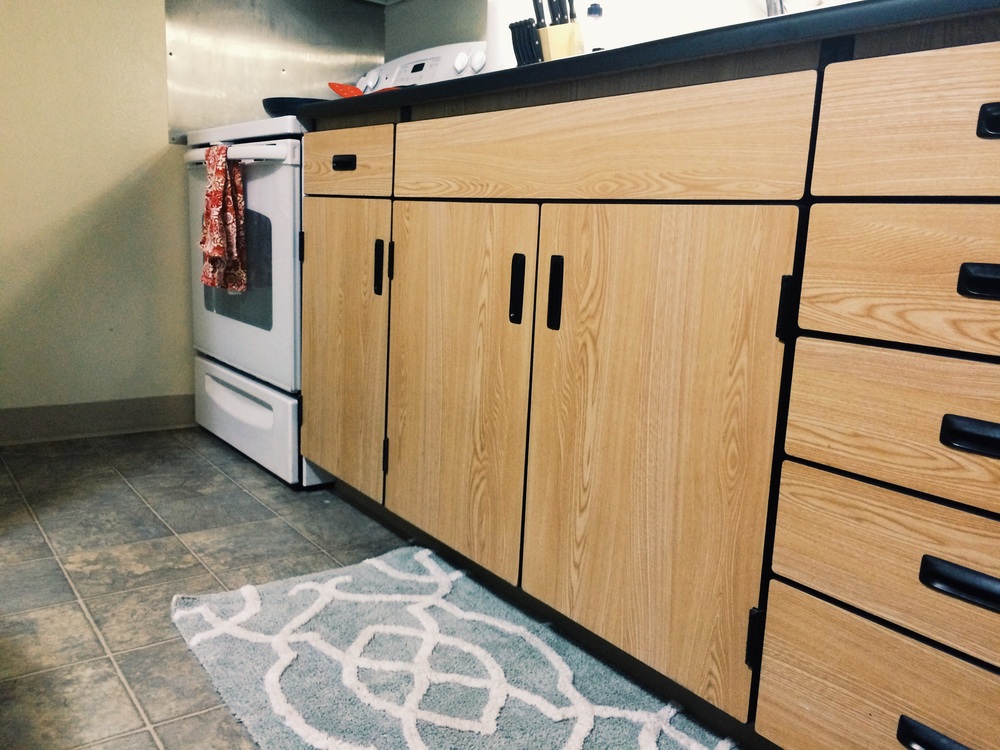
Note: Because Cob and I live in BYU housing, we really have no control over the design of our apartment. The floors are laminate. The cabinets are fake plastic wood. The counters are black and chippy. There's nothing I can do about that. BUT, I have been able to distract myself from the hideousness of our cheap apartment with some really cute décor. My décor-style is white, soft, American farmhouse/cottage. I should probably add rustic to that list. I could write a whole blogpost about my décor style and what I like and don't like but nobody would read it so I'll just say that right now I’m really into simple, neutral, handmade décor with hints of green and lots of plants and layered things. I also have limited light/cameras/photography skills so sorry if these pictures aren't "blog quality."


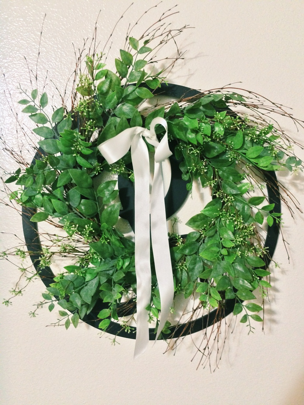
This is the entrance to our apartment. The wreath is an original that I made from a grapevine wreath and some silk flowers. I had a really hard time finding something small enough to put on the ground, but this vase does the trick. I'll put different flowers there when the weather changes.


Cob refinished this table for me while we were engaged and it is one of my favorite things. <3

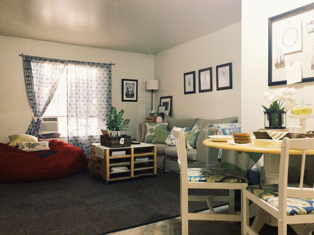
This is what you see when you open the front door. The layout of our apartment is a little weird. You can see the kitchen and most of the living room from the entrance. I don’t love having the kitchen table right there in everybody's face but it's the only thing that works. When we're not eating, I keep the table runner and wicker tray on the table, to help tone down the yellow table top. The chicken wire frame is another DIY project that I'm very proud of. It was super easy and relatively cheap to make and it's just so fun and farmhouse!


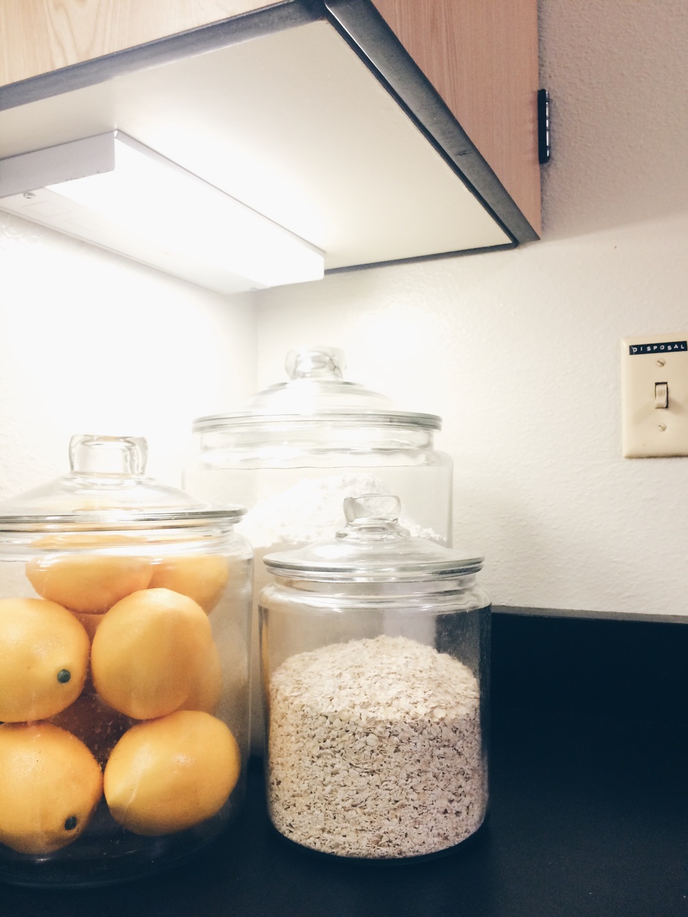
To the right of the table is the kitchen. Our counter space is limited but I made room for my jars (check out all the different things you can put in them HERE) and our knife set, since we use that all the time. I would like to keep this blue rug in the kitchen, but it gets so dirty so fast I'm not sure if it's worth it!


If you turn around in the kitchen, you can see the living room in all it's glory. The beautiful couch is a hand me down from my cousin, Tally, and I feel grateful every day that we don't have the old plaid one from my parent's basement.


The long green pillows on the couch are from Home Goods and the others are from Pier 1. I spent more money on pillows than I would have liked, but it's the only spot where I really highlight all the colors in the apartment, so it was really important that everything match perfectly. The one in the middle is my most favorite pillow ever and if anyone ever touches it when they come over I will probably cry.


On one side of the couch is a bookshelf and Cob's work area. It's not as decorative as I would like it to be, but there has to be SOME space in this apartment that we can actually use and this is it. Lol. Please notice the books arranged by color.


On the other side of the couch is a filing cabinet. I have a bunch of my favorite pictures and prints framed and displayed on top. One of my favorite things to do is rip pictures out of magazines for the frames at the back of the table. It's a lot easier than printing large pictures and it's a lot cheaper!


Sitting in front of the couch is our coffee table. The coffee table was a gift handmade by my brother, Andrew. I LOVE IT SO MUCH. I love the light wood and the white top. I was surprised how well it matched everything else in our apartment.


On the opposite wall we have the desk where I keep my work supplies and computer. To the right is the bookshelf, which matches with the coffee table. // I'm getting kind of stressed just thinking about how many mismatched pieces of furniture we have. //


I had a really really really hard time styling the bookshelf until I stopped trying to put so many books on it. I know some people have a big problem with having a bookshelf with hardly any books, but I just was not happy with the way it looked until I took the books off. I actually styled the whole bookcase after THIS one, because I couldn't find another picture that I liked. It's a work in progress, seriously. (And yes, my husband thinks I'm crazy for spending 5+ hours making a bookshelf look cute.)


Down the hall we have the bathroom and bedroom which are not quite ready to be showcased. (I don't think the bathroom will ever be ready to showcase.) I'm working on redesigning the bedroom right now and then I'll take some pictures and take you on a tour there!


Kind of obsessed with this little cake stand. I just had to post a picture of it.

I hope someone besides me enjoyed looking at my apartment! Thanks for visiting!

♡♡♡
Rebecca

Saturday, August 1, 2015

Reading Response: Home

I read the book Home during my first summer AWAY from home, when I was experiencing acute loneliness and frustration with myself and how my life felt at the time. This book touched me in a very personal way and I have re-read it many times since. It's warm and wondrous and sad and I want to tell you why:


Quick background: Home is a contemporary retelling of the parable of the prodigal son. It doesn't follow the bible story exactly but the premise is the same. The book is sister to Robinson's earlier novel, Gilead, which tells the same story from a different point of view. I like Home more than Gilead because it moves a little faster and is easier to read.

Home takes place in the small town of Gilead, Iowa. It tells the story of Jack, the oldest son and black sheep of the of Boughton family, who, 20 years after running away in college and getting a sixteen year-old girl pregnant, has come home. He returns, expecting to find shame and disgust and instead is greeted with gentleness and grace. Glory (the youngest daughter, and the narrator), tries to make Jack feel comfortable in the home he always felt alien to. She allows him to work through his problems on his own while encouraging him to make amends with their father, but somehow her kindness and mercy make him feel less deserving and more foreign. The story is two-fold, because as Glory tries to help Jack, she learns a great deal about herself.

I love the book Home because it teaches principles of family and forgiveness in very personal ways. Even though Glory and her father are kind to Jack, he still feels uncomfortable and unwanted. He's bothered by the mistakes he has made, and he's even MORE bothered by the fact that he can't seem to change. As Glory puts together the pieces of Jack's past, she is forced to confront some issues of her own, and discovers that maybe she is just as lost as he is. She suffers from her own doubts and her own disillusionment with life. One of my favorite lines from the book is after Glory finishes praying. She says, "She knew that was not an honest prayer, and she did not linger over it. The right prayer would have been, Lord . . . I am miserable and bitter at heart, and old fears are rising up in me so that everything I do makes everything worse." The discouragement and confusion that Glory feels is so tangible in that moment. She is miserable and bitter at heart and she doesn't know what to do. I think many of us have felt that way at one time or another.

I won't ruin the rest of the book for you (not that you can't figure it out), but I will close by saying that this book is definitely worth reading. The writing is quiet and poetic and personal, and the story isn't just about Jack or Glory--the main character is actually their father. But on a different level, it's about all of us. It's the tale of two very different people who are trying to find their way in the dark, and how they help each other get home. Near the end of the book, Glory says all of this perfectly. "Weary or bitter or bewildered as we may be, God is faithful. He lets us wander so we will know what it means to come home."

There's a lot more to Home than I have talked about on this blog. Other (better) reviews can be found here:
New York Times
GoodReads
The Paris Review

♡♡♡
Rebecca

Friday, July 31, 2015

How To Create a Graphic Design Portfolio

My younger brother is applying for his first college job. He is really comfortable with design software, but his portfolio is still in the beginning stages. I typed up my advice for him and thought someone else might benefit from it, too.

The first time I made my "portfolio" (I have to use quotation marks because it wasn't even a real portfolio, looking back on it), I had NO idea what I was doing. There are so many things that seem to be "common sense" to me now, but they were really hard for me to figure out and I wish someone had just told me that you shouldn't put your portfolio in a binder! So I'm telling you. Don't make the same mistakes I did.

When I got my first job as a designer at BYU, I really didn't have a great portfolio. I had done some posters and invitations for family and friends, but I really didn't have any "name brand" clients, because I had never really been paid for my work. That's OK. Even the most basic portfolio can show your style, organization, and most importantly, your potential.

You may have already done a lot of the grunt work in finding your old work and organizing it, but I just wanted to explain how I put together my portfolio. (I initially told my brother to put his portfolio online (like on a website) and I still think that's a great idea, but for now, I would just make a PDF and get it out there!)

Read on:

1. Collect all the design work you've ever done.
T-shirts, posters, binder covers, invitations, logos, ANYTHING. Don't be picky. Even drawings, sketches, and unfinished projects can be valuable. If you have digital work like photography, videography, or video editing, I would definitely include that. Go through your old files and folders it all and lay it out. (If all your files are digital, I would even suggest putting each project on a different page and printing them all. Something magical happens when you can hold your work in your own hands.)

2. Organize your work.
Put each project into a category. You might have, "Branding" for logo designs, "Print work" for posters and invitations, and "Apparel" for t-shirts. Seeing the different categories (and how much is in each category) gives you a good idea of what your strengths and weaknesses are.

3. Select your best work.
I know when you don't have a lot of work, it can be scary to take something out. But the truth is, you are better off to have 3 good pieces than to have 10 mediocre pieces. And you're better off having 3 mediocre pieces than 10 terrible pieces! (3-5 is probably a solid number for beginning portfolios). If you really don't have enough work, look at step 4.

4. *IF YOU HAVE TIME* Make something new.
I hesitate to add this because if you're reading this, you're the type of person who wants to have an amazing portfolio right off the bat. But the fact is, if you haven't have a paying job as a designer of some sort, you're not going to have 100% top quality professional work. That's OK. This portfolio is just the vehicle to getting you a job. It will grow and evolve over time. So don't worry too much about adding new pieces if you're just trying to get your work out the door and into the hands of an employer.

However, if you DO have the time, it would definitely be to your benefit to make something new. Choose the category of your portfolio that is most lacking and make something. Get online, get on Pinterest, do some research, find something interesting and copy it. (Don't copy it exactly, obviously. Just find something to inspire you and make your own version of it.)

5. Put it all together.
his is the fun part! Make a cover. Make a table of contents. Then put in each of your projects in the assigned category. (Page numbers are definitely a good idea for a physical portfolio.) Each project needs a title and a SHORT explanation (see example below:)


If you are the kind of person who doodles or sketches things out, I would absolutely include a section in the back called "The Creative Process" or something cheesy like that. People LOVE to see how your ideas went from your brain to your pencil to your portfolio. (Plus, it's a great way to add some bulk to your portfolio without having to polish a whole project.)

6. Format it.
This is probably the part you are wondering about the most. Some jobs will let you upload your portfolio online like you upload your resume. If this is the case, you will want to have a digital/electronic portfolio. That probably sounds more complicated than it really is. It just means it needs to be a PDF you can email or upload as needed. Here's what I do: When I have all my projects collected and organized, I count them off, and then I make an Adobe Illustrator document with that many pages, plus one for the cover, one for the table of contents, and one for the back. So if I have ten projects, I would make an Illustrator document with 13 pages. Make sense? Then I just place each of my projects on a separate page. (If you don't have Adobe Illustrator, you can do the same thing in Microsoft Word, but it will be a little more complicated). I honestly don't really know why this is a thing, but professional designers ALWAYS put their portfolio on 11x17 pages in the landscape (hamburger) orientation. It might not make very much sense but trust me, if you put your portfolio on an 8x11 portrait page, you are going to look like a total rookie. Once your portfolio is all together, you just save as a PDF and Voila! You're done! (Pro tip: If you're uploading or emailing your resume, you'll want it to be a reasonable size, somewhere around 10mb. That can be hard to do when you have so many pictures and high resolution files, so if your file is just huge, just google "compress pdf file size" and there's like a million online services that will shrink your pdf without ruining your files. The one I use the most is called "Small PDF.")

DON'T FORGET:
* Proofreading. Don't save or send or print ANYTHING until you have checked for typos so many times that you feel like your head is going to explode. Have your mom read it; read it out loud, do whatever you have to do to make sure you don't put all this work into a portfolio just to look like an idiot when you send it to someone.

* Printing. Once you have your PDF all nice and neat, you can and should make a physical copy of it. Take the file to FedEx/Kinkos Office and have it printed. Don't print it on glossy paper, that's what amateurs do. Professionals always use MATTE paper. Get the whole thing bound on the left side and then you're done! I like to put clear covers on the front and back of my portfolio but I know a lot of designers don't like that, so just use your judgment.

* Matching. Make your resume and your portfolio match. Use the same font, make the same header, it really doesn't matter, but employers go crazy for that kind of thing!

*Here's some ideas for things you can design quickly that will give your portfolio more street cred:
  • Posters (especially for events.)
  • Flyers (Half page/quarter page designs for small-scale events)
  • Invitations (DON'T do invitations for bridal or baby showers. Try a housewarming party, Christmas party, or employee appreciation event.)
  • Programs (Church programs don't count!)
  • Business cards
  • Letter head
  • Calendars
  • Planners
  • A cool to-do list template (maybe a notepad you did in graphics???)
  • Book covers
  • DVD covers
  • CD covers
  • Tags
  • T-shirts
  • Jerseys
  • Articles (like one in a magazine)
  • Nature photography

I hope this helps! Honestly, when it comes right down to it, you shouldn't stress too much because entry level design jobs aren't expecting too much. Just share what you have and it will all work out.

♡♡♡
Rebecca

Wednesday, July 15, 2015

Blog Design Tips

I consider myself an avid blog reader. Usually, if the content is good, I am willing to overlook bad design. However, the design of a blog DOES have a huge impact on the quantity and quality of audience it attracts.

Below are some of my tips for improving your blog design, as well as several great resources:
  • Pay attention to your navigation. Make it easy for your readers to get around. Here's one simple test you can try to ensure your website works properly: Get someone who isn't terribly tech savvy (like your dad) and give him a task. "Go to my site, read my latest blog post, make a comment, and then read my Contact page." If they can do it without any help and without getting frustrated, it's a success!
  • Clean up your sidebar. So many blogs are full of pictures and icons and ads and it's so distracting! If it doesn't need to be there, get rid of it!
  • Try a hello bar at the top of your website to make announcements and highlight important information.
  • Don't center align your text. It's hard to read and it makes it look like you don't know what you're doing.
  • DON'T write in all lowercase letters. Again, it's hard to read and it's extremely annoying! Just use normal characters and punctuation and you'll be fine.
  • Feel free to include ads and graphics on the sidebar of your website. However, if there are ads popping up in the middle of your post, you can be sure you're losing half your readers. Keep it clean and classy, folks.
  • Include a link to donate to your blog through PayPal. I know that maintaining a blog is expensive and I would be happy to donate ten bucks to some of my favorite writers, especially if it meant that they wouldn't include silly sponsorships and giveaways every other post.
  • Check the sizes of your pictures. Sometimes blogs don't load and readers exit before reading a thing!
  • Be consistent. If sometimes you post in Times New Roman and other times you post in Comic Sans, it's going to look messy and unorganized. Make sure all your text is consistent and I would even consider making all your post pictures the same size.
  • Consider including a search bar as well as an archive on your site. If you don't use tags properly, searching by name or category isn't going to work for your readers. Give them the option of looking for content both ways and you'll both be happier.
  • Embrace white space. This is my number one tip for design in general. Fight the need to fill every corner of your digital world with buttons and colors and advertisements. Let it breathe!

These are some resources I found helpful when looking for blog design tips for myself:
A Beautiful Mess: 10 Blog Layout Tips
INCOME: Design Tips for Beginning Bloggers
Jeff Bullas: Blog Design Tips to Make Sure People Stop to Read
Sparring Mind: Blog Design on a Budget


The best advice I can give when it comes to blog design, theme, or style. Find someone who's blog you love, just based on aesthetic principles. Then copy it! By the time you fit your own information and personality there, it won't be a copy at all, but that's a great way to start.

Thanks for reading!

♡♡♡
Rebecca

Tuesday, May 12, 2015

Easy Decorating: Things You Can Put in a Jar

As many of you may know, I have recently redecorated my entire apartment. I had a very specific look I wanted to achieve and part of that included glass jars and vases filled with different items.

I filled my jars with these green fuzzy moss balls I got a TJ Maxx. But I have several other ideas for what you could put in a jar. I made an entire list, in fact, so as to help other jar-fillers. Here you go!


NATURE ITEMS

Rocks
Sticks
Dirt
Moss
Grass
Acorns
Chestnuts
Pinecones
Bird's nests
Walnuts
Flowers
Leaves
Pussy Willow
Seeds
Leaves


FRUIT/VEGETABLES

Lemons
Limes
Pears
Apples
Bananas
Avocados
Bell peppers
Corn
Dried peas
Black beans
Lima beans
Coffee beans


BAKING SUPPLIES

Oats
Rice
Salt
Sugar
Flour


SEASONAL ITEMS

Candles
Bells
Ornaments
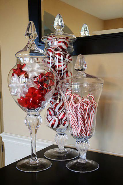
Candy canes
Candy kisses
Mistletoe
Garland
Sparkly fruit (see above)
Pumpkins
Candy corn
Cobwebs
Peeps
Easter grass
Easter eggs
Real eggs!
Cadbury eggs
Corks
Rhinestones
Sand
Starfish
Shells
Rope
Flags
Bird seed


MISCELLANEOUS ITEMS

Buttons
Pennies
Newspaper
Magazines
Dice
Ribbon
Movie tickets
Literally anything else that will fit in a jar

Is there anything I missed? I love jars!

♡♡♡
Rebecca

Wednesday, May 6, 2015

Choose Happy

Enthusiasm is a divine virtue in my book. The ability to face doubt and discouragement with a cheerful countenance is not ignorance, it's courage. There are those who would argue that slapping on a smile when the world is falling apart is foolish and unnecessary. I disagree. (I am not suggesting that "grin and bear it" is a cure for real mental illnesses such as anxiety and depression. I am speaking only to regular grouches and grumps.) I think happiness is a choice. And a very smart choice at that.

Here's why:
1. Fake smiling can make you actually happy. Even a forced, fake smile tricks your brain into thinking you're happy!
2. Being happy makes you physically healthy. The truth is, happy people feel better and live longer. (It really should be no secret that psychological well-being and physical well-being are connected, but now there's hard science to back it up.)
3. Innovation is linked to happiness. Think about it. When was the last time you felt creative after a bad day? The happier we are, the more motivated we will be to find solutions to our problems. Happy people will create a better future for all of us.
4. Similarly, happy people tend to be smarter and more successful. Optimism helps us understand complex problems and see things from new angles.
5. Happy people are better looking! No hard evidence for this one, but smile lines are definitely preferable to a permanent furrowed brow.
6. Being happy makes you a better person. Happy people aren't so wrapped up in themselves that they can't help anyone else. They're responsible, compassionate, forgiving, and motivated.


Happiness is difficult. There is a strange tendency to assume that pessimistic people have a clearer mental vision than the rest of us or a greater conception of the consequence of living. I find that attitude keeps me from developing happy relationships, creative ideas, and a sense of spiritual well-being. So I have made the permanent choice to be happy. What will you choose?

Thanks for reading!

♡♡♡
Rebecca
Monday, April 6, 2015

Reading Response: The Substance of Style

Some of you might know that I am fascinated by product design. I feel like the psychology and science behind making a beautiful, functional product is seriously underestimated. A few months ago I read the book: The Substance of Style: How the Rise of Aesthetic Value is Remaking Commerce, Culture, and Consciousness by Virginia Postrel. Postrel wrote the book as an afterthought to her Doctorate thesis, so it has a very academic tone and every argument is well-documented. The great thing about this book is that it used science and data to explain experiences that I previously defined as only qualitative. I loved understanding the technicalities of design and consumer behavior. Unfortunately, this book is not very well-organized. There were several Aha! moments for me while I was reading, but the chapters all overlapped and now I feel like it's hard to explain. So in an effort to understand everything I read, I thought I would write my own book report and point out the most interesting parts:

1. Aesthetics have inherent value and power.
The first thing Postrel mentions in this book is that aesthetics (or style, as she refers to it) have value. I think this is obvious, especially in an age of 11 inch computers, driverless cars, and retina-display cell phones. Aesthetics help us to see and understand the world around us. Postrel quotes the famous theorist, Ellen Dissanayake who says, "…Art is the practice of “making special,” a behavior designed to be “sensorily and emotionally gratifying and more than strictly necessary.” Postrel says that this "making special" is a universal and innate ability of human beings' evolved biological nature. She states, "Making special offers a useful insight into our aesthetic age. Having spent a century or more focused primarily on other goals—solving manufacturing problems, lowering costs, making goods and services widely available, increasing convenience, saving energy—we are increasingly engaged in making our world special. More people in more aspects of life are drawing pleasure and meaning from the way their persons, places, and things look and feel. Whenever we have the chance, we’re adding sensory, emotional appeal to ordinary function.” I could not agree more! However, the really interesting thing Postrel explains is that making special is INHERENT. Style is inherently important to us, regardless of the function it's attached to. Aesthetics have value because aesthetics provide pleasure, meaning, and usefulness, which may be SUBJECTIVE, but cannot be denied.


2. Aesthetics are a profitable good
There was a time when products were created solely for function and form was ignored. But the truth is, products like that DON'T EXIST any more. We have demanded a world carefully designed and beautifully styled because we value aesthetics. But I think it's important to recognize that aesthetics are not the highest good. They are not the only good. But they are A good and we (business owners, product designers, and every day consumers) cannot escape them. In SoS (The Substance of Style), Postrel explains the economic value of aesthetics this way: "Curmudgeons may grouse about the price of its coffee, but Starbucks isn't just selling beverages. It's delivering a multisensory aesthetic experience, for which customers are willing to pay several times what coffee costs at a purely functional Formica-and-linoleum coffee shop." So in today's competitive marketplace, aesthetics is one of the best ways to differentiate yourself.


3. We can live in a world that is both pretty and smart.
There is this strange notion that using aesthetics to sell a product is a form of manipulation. Consumers are convinced that sensory impressions are somehow false and misleading. However, SoS argues that the rise of aesthetics comes from an innate need for pleasure, meaning, and usefulness. Postrel says, “Beauty is not a measure of goodness or truth, but neither is aesthetic pleasure a sure sign of decadence or a foolish waste of time. It is valuable on the margin, as one good among many. Aesthetics is pre-rational or non-rational, not irrational or antirational. Look and feel appeal directly to us visual, tactile, emotional creatures, but they do not inevitably override our cognitive faculties, much less our sense of right and wrong. The fear that we’ll get carried away, accepting a dumb but pretty world, is a worthwhile warning. Aesthetic abundance does pose that risk. But we will realize that fate only if we forget that aesthetics can be a complement to, not merely a substitute for other values.” Similar to the discussion above, aesthetics are just one good, not the ultimate good, in the modern marketplace. We can't ignore the need for a pretty, aesthetically pleasing world. But we also cannot ignore the need for a world that works. So rather than fear aesthetics as some form of devilish deceit, we can use aesthetics to create products that are both stylish and substantive. Donald Norman, the father of usability, said it best when he said, "Let the future of everyday things be ones that do their job, that are easy to use, and that provide both meaning and pleasure. We can demand that everyday objects be both smart and pretty.”

It's SO difficult to explain and summarize a subject that is usually dismissed as fluffy and meaningless, but I would just like to add that aesthetics (design, style, form, whatever you want to call it) is everywhere and we should be careful consumers of what we buy, read, and sell. I recommend this book to anyone who wants to increase their understanding of aesthetics in the marketplace and in the mind.

Thanks for reading!

♡♡♡
Rebecca